How to style
Read first Use your own component if you haven't
Bring your own component
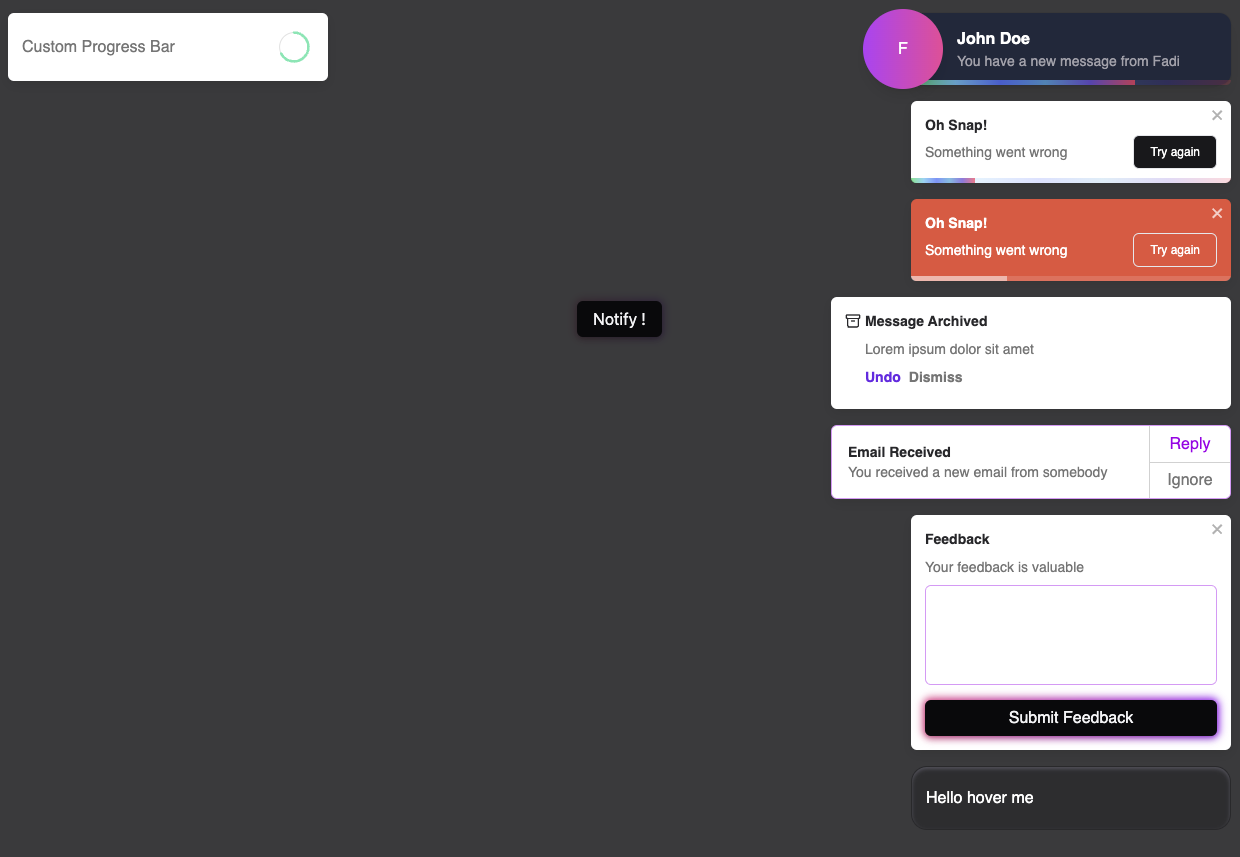
This is by far the most flexible and the best approach when you need to fully customize the notifications. As you can see, you can accomplish a lot.
Head to stackblitz to check the code.
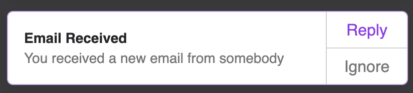
Let's review together the one with the split buttons for example. I'm using tailwind, but you can write your own css of course.
import { ToastContainer, ToastContentProps, toast } from 'react-toastify';

export default function App() {
  const notify = () => {
    toast(SplitButtons, {
      closeButton: false,
      // remove the padding on the toast wrapper
      // make it 400px width
      // add a thin purple border because I like purple
      className: 'p-0 w-[400px] border border-purple-600/40',
      ariaLabel: 'Email received',
    });
  };

  return (
    <div className="grid place-items-center h-dvh bg-zinc-950/80">
      <Button onClick={notify}>Notify !</Button>
      <ToastContainer autoClose={false} />
    </div>
  );
}


function SplitButtons({ closeToast }: ToastContentProps) {
  return (
    // using a grid with 3 columns
    <div className="grid grid-cols-[1fr_1px_80px] w-full">
      <div className="flex flex-col p-4">
        <h3 className="text-zinc-800 text-sm font-semibold">Email Received</h3>
        <p className="text-sm">You received a new email from somebody</p>
      </div>
      {/* that's the vertical line which separate the text and the buttons*/}
      <div className="bg-zinc-900/20 h-full" />
      <div className="grid grid-rows-[1fr_1px_1fr] h-full">
        {/*specifying a custom closure reason that can be used with the onClose callback*/}
        <button onClick={() => closeToast("reply")} className="text-purple-600">
          Reply
        </button>
        <div className="bg-zinc-900/20 w-full" />
        {/*specifying a custom closure reason that can be used with the onClose callback*/}
        <button onClick={() => closeToast("ignore")}>Ignore</button>
      </div>
    </div>
  );
}
Custom progress bar
When rendering your custom component, the isPaused prop is injected. It let you know when you should play or pause your animation for the progress bar.
function App() {
  const notify = () => {
    toast(CustomComponent, {
      autoClose: 8000,
      // removes the built-in progress bar
      customProgressBar: true
    });
  };

  return (
    <div>
      <button onClick={notify}>notify</button>
      <ToastContainer />
    </div>
  );
}

// isPaused is now available in your component
// it tells you when to pause the animation: pauseOnHover, pauseOnFocusLoss etc...
function CustomComponent({ isPaused, closeToast }: ToastContentProps) {
  return (
    <div>
      <span>Hello</span>
      <MyCustomProgressBar isPaused={isPaused} onAnimationEnd={() => closeToast()} />
    </div>
  );
}
Override css variables
Below the list of the css variables that are exposed by the library.
:root {
  --toastify-color-light: #fff;
  --toastify-color-dark: #121212;
  --toastify-color-info: #3498db;
  --toastify-color-success: #07bc0c;
  --toastify-color-warning: #f1c40f;
  --toastify-color-error: hsl(6, 78%, 57%);
  --toastify-color-transparent: rgba(255, 255, 255, 0.7);

  --toastify-icon-color-info: var(--toastify-color-info);
  --toastify-icon-color-success: var(--toastify-color-success);
  --toastify-icon-color-warning: var(--toastify-color-warning);
  --toastify-icon-color-error: var(--toastify-color-error);

  --toastify-container-width: fit-content;
  --toastify-toast-width: 320px;
  --toastify-toast-offset: 16px;
  --toastify-toast-top: max(var(--toastify-toast-offset), env(safe-area-inset-top));
  --toastify-toast-right: max(var(--toastify-toast-offset), env(safe-area-inset-right));
  --toastify-toast-left: max(var(--toastify-toast-offset), env(safe-area-inset-left));
  --toastify-toast-bottom: max(var(--toastify-toast-offset), env(safe-area-inset-bottom));
  --toastify-toast-background: #fff;
  --toastify-toast-padding: 14px;
  --toastify-toast-min-height: 64px;
  --toastify-toast-max-height: 800px;
  --toastify-toast-bd-radius: 6px;
  --toastify-toast-shadow: 0px 4px 12px rgba(0, 0, 0, 0.1);
  --toastify-font-family: sans-serif;
  --toastify-z-index: 9999;
  --toastify-text-color-light: #757575;
  --toastify-text-color-dark: #fff;

  /* Used only for colored theme */
  --toastify-text-color-info: #fff;
  --toastify-text-color-success: #fff;
  --toastify-text-color-warning: #fff;
  --toastify-text-color-error: #fff;

  --toastify-spinner-color: #616161;
  --toastify-spinner-color-empty-area: #e0e0e0;
  --toastify-color-progress-light: linear-gradient(to right, #4cd964, #5ac8fa, #007aff, #34aadc, #5856d6, #ff2d55);
  --toastify-color-progress-dark: #bb86fc;
  --toastify-color-progress-info: var(--toastify-color-info);
  --toastify-color-progress-success: var(--toastify-color-success);
  --toastify-color-progress-warning: var(--toastify-color-warning);
  --toastify-color-progress-error: var(--toastify-color-error);
  /* used to control the opacity of the progress trail */
  --toastify-color-progress-bgo: 0.2;
}
Override existing css classes
If overriding the css variables and using your own component are not enough for you, you can override the existing CSS classes. Below, a list of the CSS classes used.
Classes used for animation and media query are omitted.
/** Used to define container behavior: width, position: fixed etc... **/
.Toastify__toast-container {
}

/** Used to define the position of the ToastContainer **/
.Toastify__toast-container--top-left {
}
.Toastify__toast-container--top-center {
}
.Toastify__toast-container--top-right {
}
.Toastify__toast-container--bottom-left {
}
.Toastify__toast-container--bottom-center {
}
.Toastify__toast-container--bottom-right {
}

/** Classes for the displayed toast **/
.Toastify__toast {
}
.Toastify__toast--rtl {
}

/** Used to position the icon **/
.Toastify__toast-icon {
}

/** handle the notification color and the text color based on the theme **/
.Toastify__toast-theme--dark {
}
.Toastify__toast-theme--light {
}
.Toastify__toast-theme--colored.Toastify__toast--default {
}
.Toastify__toast-theme--colored.Toastify__toast--info {
}
.Toastify__toast-theme--colored.Toastify__toast--success {
}
.Toastify__toast-theme--colored.Toastify__toast--warning {
}
.Toastify__toast-theme--colored.Toastify__toast--error {
}

.Toastify__progress-bar {
}
.Toastify__progress-bar--rtl {
}
.Toastify__progress-bar-theme--light {
}
.Toastify__progress-bar-theme--dark {
}
.Toastify__progress-bar--info {
}
.Toastify__progress-bar--success {
}
.Toastify__progress-bar--warning {
}
.Toastify__progress-bar--error {
}
/** colored notifications share the same progress bar color **/
.Toastify__progress-bar-theme--colored.Toastify__progress-bar--info,
.Toastify__progress-bar-theme--colored.Toastify__progress-bar--success,
.Toastify__progress-bar-theme--colored.Toastify__progress-bar--warning,
.Toastify__progress-bar-theme--colored.Toastify__progress-bar--error {
}

/** Classes for the close button. Better use your own closeButton **/
.Toastify__close-button {
}
.Toastify__close-button--default {
}
.Toastify__close-button > svg {
}
.Toastify__close-button:hover,
.Toastify__close-button:focus {
}
Passing css classes to component
The ToastContainer accept the following props for styling:
- className: applied to the container
- toastClassName: applied on the toast wrapper
- progressClassName: applied on the progress bar
<ToastContainer className="foo" style={{ width: "2000px" }} />
When displaying a notification you can also set some css classes:
- className: applied on the toast wrapper (this override
toastClassNameis set by the container ) - progressClassName: applied on the progress bar (this override
progressClassNameis set by the container )
toast("Custom style", {
  className: "black-background",
  progressClassName: "fancy-progress-bar",
});
Css classes as function
You can also provide a function. This is what it looks like with tailwind css
const contextClass = {
  success: "bg-blue-600",
  error: "bg-red-600",
  info: "bg-gray-600",
  warning: "bg-orange-400",
  default: "bg-indigo-600",
  dark: "bg-white-600 font-gray-300",
};

const App = () => {
  return (
    <>
      <Main />
      <ToastContainer
        toastClassName={(context) =>
          contextClass[context?.type || "default"] +
          " relative flex p-1 min-h-10 rounded-md justify-between overflow-hidden cursor-pointer"
        }
        position="bottom-left"
        autoClose={3000}
      />
    </>
  );
};
How to style with styled-components
Extend existing css classes
You can override the css classes with styled-components. You can find the list of the css classes used here. This is where you will also define the style for your notification.
import React from "react";
import styled from "styled-components";
import { ToastContainer } from "react-toastify";

const StyledContainer = styled(ToastContainer)`
  // https://styled-components.com/docs/faqs#how-can-i-override-styles-with-higher-specificity
  &&&.Toastify__toast-container {
  }
  .Toastify__toast {
  }
  .Toastify__toast-body {
  }
  .Toastify__progress-bar {
  }
`;
Pass css classes to props
const StyledToastContainer = styled(ToastContainer).attrs({
  className: "toast-container",
  toastClassName: "toast",
  bodyClassName: "body",
  progressClassName: "progress",
})`
  /* .toast-container */
  width: 100%;

  /* .toast is passed to toastClassName */
  .toast {
    background-color: var(--color-black);
  }

  button[aria-label="close"] {
    display: none;
  }

  /* .body is passed to bodyClassName */
  .body {
  }

  /* .progress is passed to progressClassName */
  .progress {
  }
`;
Mobile
On mobile, the toast will take all the available width.